A guest room is one of the most personal spaces in hospitality.
It is where the guest closes the door.
Where luggage is dropped.
Where the outside world is supposed to become quieter.
And where design decisions that felt impressive in public spaces are suddenly experienced from only a few feet away.
That changes the role of art.
A lobby can support drama.
A corridor can create rhythm.
A meeting room may need focus.
But in a guest room, the artwork often has a more restrained responsibility:
help the room feel restorative.
That does not mean bland.
It means the image, scale, finish and placement should support the emotional job of the room rather than compete with it.
Start With the Feeling, Not the Empty Wall
The easiest way to choose artwork is to begin with the available wall.
The better way is to begin with the guest experience.
Before asking which image fits above the bed, ask:
What should this room help someone feel?
Calm?
Sheltered?
Open?
Warm?
Grounded?
Quietly elevated?
Different guest rooms can require different emotional qualities.
A wellness-oriented suite may benefit from softness and deep visual calm.
An urban business hotel may need psychological spaciousness after a long day of meetings.
A resort room may need stronger connection to landscape and place.
A luxury residential bedroom may need warmth and intimacy.
The emotional objective should guide the image.
Not Every “Calm” Image Creates the Same Kind of Rest
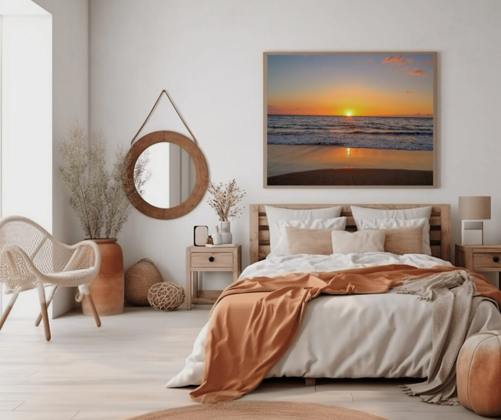
This distinction matters.
A calm seascape and a calm forest are not emotionally identical.
Water can feel soft and expansive.
A broad horizon can create mental distance.
Forest can create refuge and enclosure.
Distant mountains can feel stable and grounding.
Atmospheric light can make a room feel gentle and human.
All of these may be peaceful.
But they create different kinds of peace.
That is why choosing artwork only by palette can lead to a visually coordinated room that still feels emotionally generic.
Color is part of the decision.
It should not be the entire decision.
Scale Changes the Experience
A small artwork can decorate a wall.
A properly scaled artwork can help define the room.
Above a bed, sofa or long console, undersized art often feels disconnected from the architecture.
The room may be beautifully furnished, but the wall still feels unresolved.
Larger artwork creates a stronger relationship with the furniture below it.
The wall becomes part of the composition.
This does not mean every guest room requires an oversized statement piece.
It means the scale should feel intentional.
A useful question is:
Does the artwork belong to the architecture, or does it look like something added after the room was finished?
That difference is often visible immediately.
Artwork Above the Bed Needs Restraint
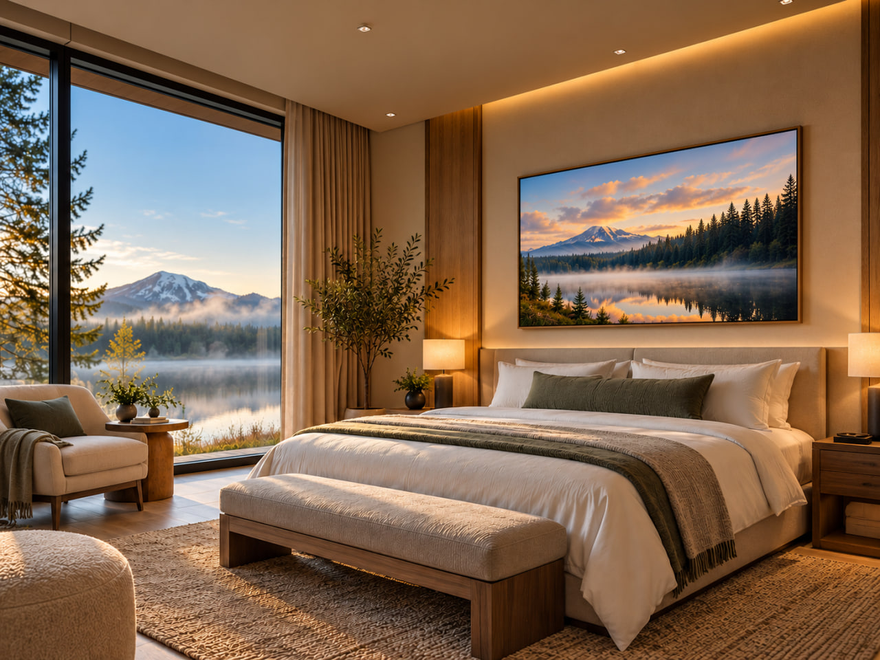
The wall above the bed is an obvious focal point.
It is also a sensitive one.
Guests spend more time in visual proximity to this wall than almost any other artwork location in the room.
An image that feels exciting for a few seconds may become visually demanding over several hours.
This is one reason I prefer guest-room artwork with a clear structure and controlled visual energy.
Too many competing elements can make the wall feel restless.
A quieter composition gives the eye somewhere to settle.
The image can still have depth, atmosphere and character.
It simply does not need to shout.
Use the Architecture to Decide Orientation
Orientation should come from the wall, not habit.
A wide wall above a king bed often benefits from a horizontal composition because it reinforces the architecture below it.
A narrow wall between windows may need a vertical image.
Two related pieces may work better than one image in a room with divided architecture.
A panoramic composition can make a long wall feel intentional and expansive.
The important thing is that the artwork and wall appear to have been considered together.
The image should not fight the proportions of the room.
The Finish Changes the Presence
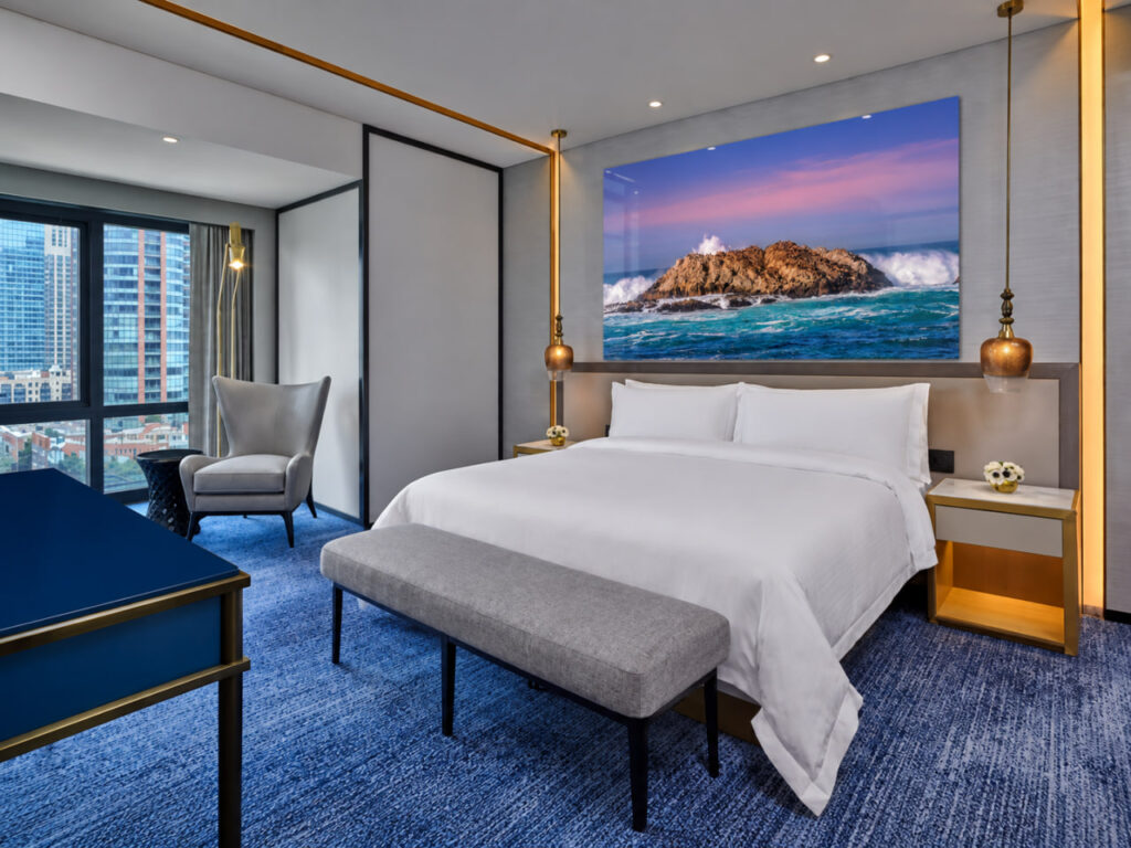
The same photograph can feel surprisingly different depending on how it is produced.
Acrylic can feel clean, architectural and highly resolved.
Canvas can soften the image and bring more warmth into the room.
Fine-art paper can feel refined and residential, particularly when the framing is carefully chosen.
Metal can create a crisp contemporary presence.
For guest rooms, I usually think about finish through two questions:
How should the artwork feel in the room?
and
How much visual presence should the surface itself have?
A very reflective finish in the wrong lighting can become distracting.
A softer finish may integrate more naturally into a warm bedroom.
The photograph matters.
But the object on the wall matters too.
Consider the Light Before Choosing the Finish
Lighting can completely change how artwork behaves.
A large window opposite the artwork may introduce reflection.
Bedside lighting may create warm highlights.
Ceiling fixtures can produce glare.
A darker room may require an image that retains presence without relying on bright illumination.
This is especially important with acrylic and other highly finished surfaces.
The solution is not automatically to avoid them.
It is to evaluate the wall in context.
Where are the windows?
What happens during the day?
What lighting is used at night?
From which positions will the artwork actually be viewed?
A finish that looks beautiful in a sample can behave differently once installed in the room.
Think Beyond the Wall Above the Bed
The bed wall is not the only opportunity.
Artwork can help define several moments within a guest room.
A piece opposite the bed becomes one of the first things the guest sees in the morning.
Artwork near a seating area can make that zone feel more intentional.
A smaller work near an entry or minibar can create continuity between arrival and rest.
A suite may benefit from a sequence rather than a single statement.
The key is hierarchy.
Not every wall needs equal visual importance.
One artwork can anchor the room.
Others can support it.
That is usually more effective than treating every empty surface as a separate decorating problem.
Local Landscape Without Becoming Literal
Hotels often want guest rooms to connect with place.
That can be very effective.
But local artwork does not need to become a postcard.
A photograph of the surrounding landscape can communicate location through atmosphere, geology, weather, vegetation or light without relying on the most obvious landmark.
This often creates a more sophisticated connection.
The guest feels the character of the region without being given a visual tourism brochure.
For me, the strongest sense of place often comes from details that are emotionally specific rather than geographically obvious.
Repetition and Variation Across Multiple Rooms
For a hotel project, selecting one successful image is only part of the challenge.
The artwork also has to work across multiple rooms.
Too much repetition can make the property feel standardized.
Too much variation can weaken the design language.
A collection approach often works well.
Images can share:
similar atmosphere,
related landscape types,
consistent color behavior,
or a common emotional quality.
The individual rooms do not need identical artwork to feel connected.
They need a coherent visual language.
The Artwork Should Still Feel Right at Night
This is an easy thing to overlook.
Guest rooms are experienced very differently at night.
The window becomes dark.
Artificial lighting becomes dominant.
The overall visual field becomes smaller.
Artwork that relied heavily on bright daylight may suddenly feel different.
This is another reason restrained landscape imagery can work so well.
A strong composition remains readable even when the surrounding room becomes quieter.
The artwork does not disappear with daylight.
It continues to support the room.
The Best Guest-Room Art Does Not Ask for Attention
There is a difference between memorable and demanding.
Guest-room artwork can be memorable because of scale, atmosphere, light or emotional clarity.
It does not need constant visual intensity.
In fact, the strongest work for a restorative environment may be the work that becomes more rewarding the longer someone lives with it.
The first impression is calm.
Then the details begin to emerge.
A line of mountains.
A reflection.
Fog moving through trees.
Light across water.
A distant horizon.
The photograph gives the eye something to return to without requiring it.
A Simple Guest-Room Art Checklist
Before approving artwork for a guest room, I would ask:
☐ What should the room help the guest feel?
☐ Does the image support that emotional goal?
☐ Is the scale strong enough for the architecture?
☐ Does the orientation fit the wall naturally?
☐ Will the finish behave well with the room’s lighting?
☐ Is the image restful without becoming visually empty?
☐ Does it connect with the larger design language of the property?
☐ If multiple rooms are involved, is there enough consistency without excessive repetition?
If those questions are resolved, the artwork is doing more than filling space.
It has a clear job.
In a guest room, the best artwork does not simply complete the wall. It helps complete the feeling of rest.