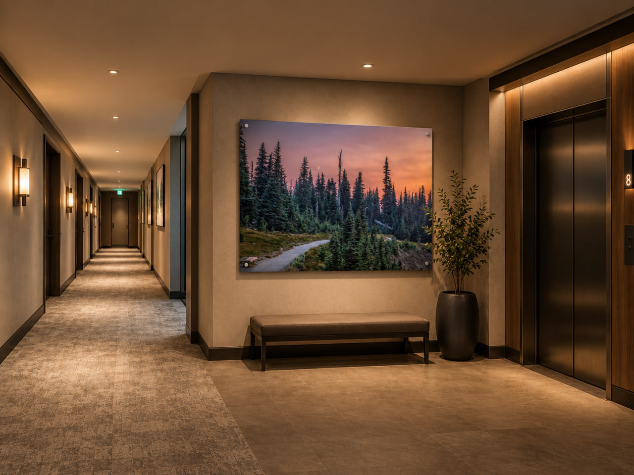
Corridor artwork has a responsibility that is easy to overlook.
It is rarely experienced the way art is viewed in a gallery.
People do not necessarily stop in front of it.
They approach.
They pass.
They see it from different angles.
They may encounter it repeatedly throughout the day.
And each time, the artwork becomes part of a larger experience of moving through the building.
This is why choosing artwork for a corridor requires a different way of thinking.
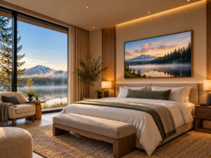
A guest room may need rest.
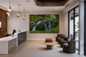
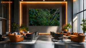
A lobby may need a memorable first impression.
A meeting room may need focus.
But a corridor has another responsibility.
It must help people move from one experience to the next without making that transition feel empty, confusing or monotonous.
The right artwork can support that journey.
Not simply by decorating the walls.
But by introducing rhythm, direction, moments of attention and a sense of continuity.
A Corridor Is Not Dead Space
Corridors are sometimes considered secondary areas of a building.
They connect the rooms where more important activities happen.
A hotel corridor leads to guest rooms.
An office corridor connects departments and meeting spaces.
A residential hallway links private and shared areas.
A healthcare corridor guides people between waiting, treatment and recovery environments.
Functionally, these spaces are about circulation.
But emotionally, they are still part of the architecture.
People experience their proportions, lighting, materials and atmosphere.
A long corridor may feel monotonous.
A narrow passage may feel compressed.
An unfamiliar hallway may create uncertainty.
An overly decorated corridor may become visually exhausting.
These responses are not determined by artwork alone.
But artwork can influence them.
It can give an otherwise repetitive environment a sense of identity.
It can introduce visual structure.
And it can make the passage feel more considered.
A corridor is not simply the distance between two rooms. It is part of how the building is experienced.
Rhythm: The Hidden Language of Corridor Art
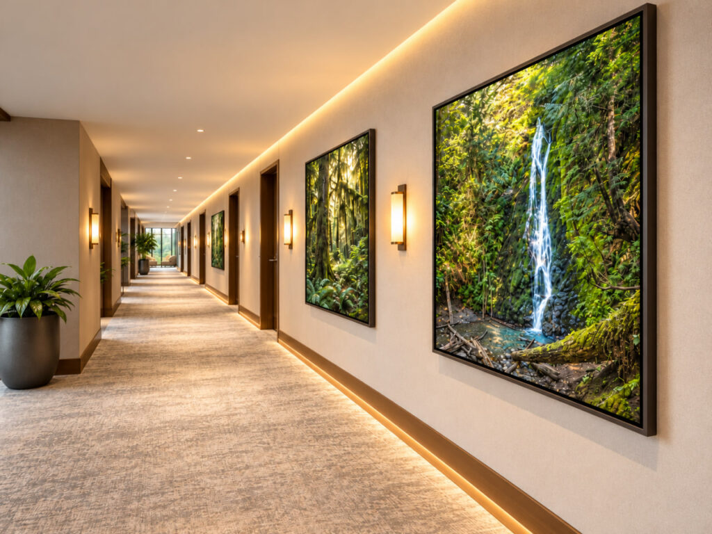
One of the most important ideas in corridor design is rhythm.
As people move through a space, they encounter repeated architectural elements.
Doors.
Lighting fixtures.
Wall panels.
Columns.
Floor patterns.
These create a natural sequence.
Artwork can work with that sequence or compete against it.
A series of photographs placed at consistent intervals may reinforce the architecture’s rhythm.
A larger artwork positioned at a visual break may interrupt that rhythm intentionally.
A sequence of related images may create a gradual transition from one part of the building to another.
The important distinction is between repetition and rhythm.
Repetition places similar elements next to one another.
Rhythm gives those elements a meaningful relationship.
In a hotel corridor, for example, several photographs might share a similar atmosphere while presenting different landscape subjects.
A quiet lake.
A forest illuminated by soft light.
A distant mountain range.
An open horizon.
The subjects change, but the visual language remains connected.
As the guest moves past them, the sequence feels intentional rather than random.
That continuity can make the corridor feel more complete.
Not Every Wall Needs an Artwork
One of the easiest mistakes in corridor design is assuming that every available wall section needs to be filled.
An empty wall is not necessarily an unresolved wall.
Sometimes it provides the visual breathing room that allows the next artwork to be appreciated.
This is especially important in long corridors.
If every wall segment contains a competing image, the entire passage can become visually demanding.
The eye has no opportunity to settle.
Nothing stands out because everything is asking for attention.
A more thoughtful approach considers the complete sequence.
Where should an artwork introduce interest?
Where should the visual experience remain quiet?
Where does the architecture naturally create a pause?
Where could a larger image become an anchor?
These questions are more useful than simply counting the available wall spaces.
Good corridor design is not about how many artworks can be installed. It is about where artwork can contribute something meaningful.
The Power of Visual Pause Points
A corridor is primarily a movement space.
But movement is rarely experienced as one uninterrupted action.
People slow down.
They approach intersections.
They wait for elevators.
They look for room numbers.
They change direction.
They pause outside entrances.
These moments create natural opportunities for artwork.
A large landscape photograph at the end of a hallway can become a visual destination.
A carefully positioned piece near an elevator lobby may create a moment of calm while someone waits.
Artwork at a corridor intersection can give that location a more memorable identity.
A quiet image near a transition into a guest-room wing can begin to establish a more restful atmosphere.
The artwork is no longer simply something encountered along the way.
It helps organize the experience of moving through the building.
This is particularly effective when the subject and placement work together.
An open mountain landscape at the end of a long corridor may create a sense of visual release.
A softly illuminated forest photograph near a quieter transition may introduce a feeling of shelter.
Water can offer continuity and calm.
The location gives the artwork its purpose.
The image gives the location its character.
Artwork at the End of a Corridor
The end wall of a corridor is one of the most interesting locations for a strong photographic image.
From a distance, it may become the primary visual destination.
The architecture directs attention toward it.
The perspective of the floor, ceiling and walls creates natural leading lines.
The artwork receives that attention.
This makes image selection especially important.
A composition with a strong central structure can work beautifully.
So can a distant horizon that gives the eye a sense of openness.
A forest pathway may extend the impression of depth.
A mountain landscape can create a stable focal point.
But not every photograph works well in this position.
A highly detailed image may become difficult to understand from a distance.
A composition with important subjects near the edges may lose clarity when viewed obliquely.
Strong contrast or excessive visual complexity may compete with the corridor’s existing perspective.
The best end-wall artwork can communicate something from far away while remaining rewarding as the viewer approaches.
It operates at more than one viewing distance.
Scale Changes How a Corridor Feels
Scale is not simply a question of matching artwork to an empty wall.
It changes the relationship between the artwork and the architecture.
A small photograph on a very long wall may feel disconnected.
Several small photographs placed without a clear system can create visual fragmentation.
A larger image may establish a stronger presence and reduce the need for additional decoration.
But oversized artwork is not automatically the solution.
Corridors have specific proportions.
They may be narrow.
They may have low ceilings.
They may be interrupted by doors, wall fixtures or safety equipment.
They may offer limited viewing distance.
A large photograph that works beautifully in an open lobby may feel overwhelming in a narrow passage.
The scale needs to be evaluated from the viewer’s actual position.
How far away will the artwork first become visible?
How close will people pass beside it?
Will the entire composition be seen at once?
Or will it be experienced gradually while walking?
I often think of artwork scale as a relationship rather than a measurement.
The image should feel connected to the dimensions and movement of the space.
A Corridor Is Experienced From an Angle
Unlike a gallery wall, corridor artwork is frequently viewed from the side.
This changes the importance of placement and finish.
A photograph may look balanced when viewed directly from the front but feel less effective when encountered from an oblique angle.
Reflections may become more visible.
Fine details may be harder to distinguish.
The apparent proportions of the work change as the viewer approaches.
This is especially relevant for acrylic and other reflective finishes.
Acrylic can create a clean, architectural presentation.
But a bright window or poorly positioned light fixture can introduce glare.
Metal prints can also produce different viewing experiences depending on surface treatment and illumination.
Canvas generally offers a softer surface character.
Framed fine-art paper can create a refined, quiet presence, particularly when the glazing is selected with the viewing environment in mind.
There is no universally correct finish for corridor artwork.
The right decision depends on the lighting, architecture, traffic and intended atmosphere.
A material that works beautifully in a guest room may need a different evaluation in a long, brightly illuminated hallway.
The practical viewing conditions matter as much as the visual character of the artwork.
Light Should Reveal the Artwork, Not Fight It
Corridor lighting serves several purposes.
It supports safe movement.
It reveals architectural details.
It contributes to the atmosphere.
And it determines how artwork is experienced.
A beautifully selected photograph can lose much of its impact if the lighting introduces strong glare or uneven illumination.
This is especially noticeable in long corridors where ceiling lights repeat at regular intervals.
The fixtures may create a sequence of reflections across glossy artwork.
A wall-mounted light may produce an unwanted hotspot.
Bright illumination may flatten an atmospheric photograph.
Very low illumination may cause a subtle landscape to lose its visual presence.
For this reason, artwork and lighting should be considered together.
The most useful questions include:
- Where are the primary light sources?
- Will the artwork be viewed directly or from an angle?
- Does the finish create distracting reflections?
- Is there enough illumination to appreciate the photograph?
- Does the lighting support the atmosphere intended for the corridor?
Good lighting does not need to make every artwork dramatic.
Sometimes its most important role is simply to allow the image to be experienced comfortably.
Nature Can Create Continuity Without Repetition
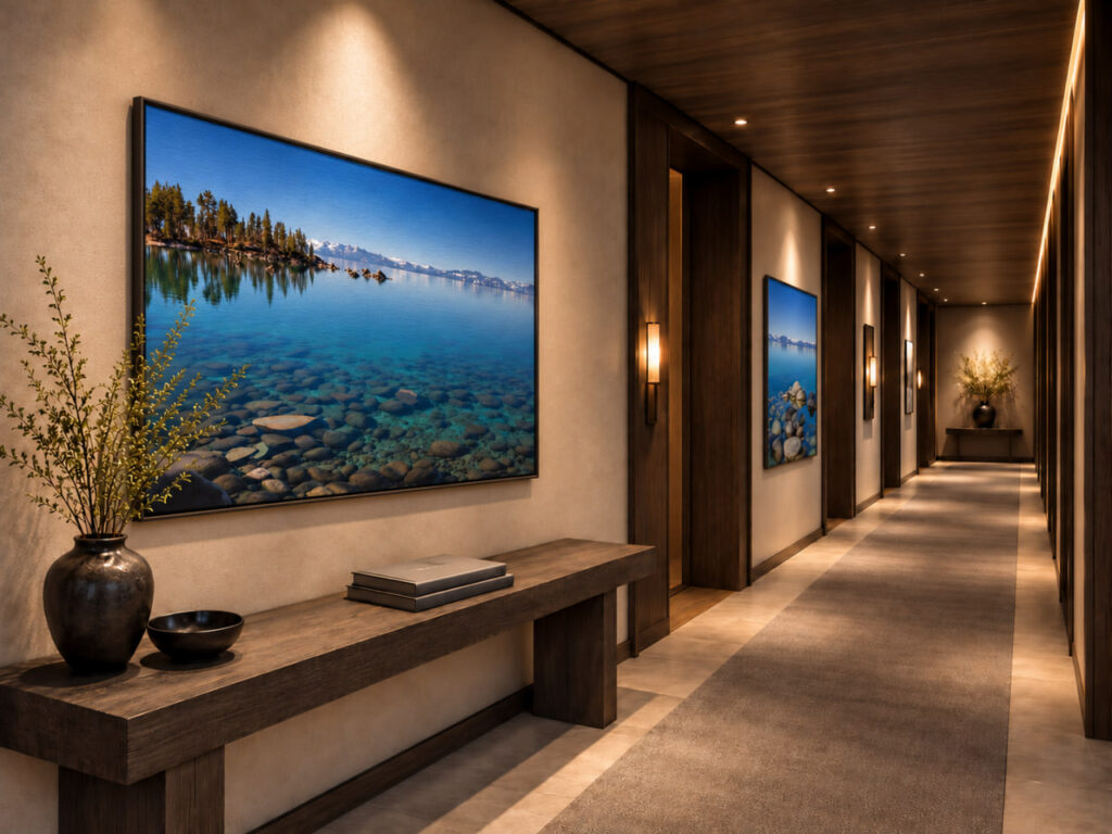
One of the strengths of landscape photography in corridor design is the opportunity to build a connected visual language.
Nature offers remarkable variety.
Water.
Forest.
Mountains.
Desert.
Atmospheric light.
Open horizons.
These subjects can communicate different feelings while still belonging to a coherent collection.
Forest imagery is particularly interesting because, as explored in The Quiet Architecture of a Forest, natural rhythm, enclosure and filtered light can create a distinctive feeling of refuge.
The connection does not have to come from identical colors.
It may come from a shared quality of light.
A similar degree of visual calm.
Related compositions.
Consistent image proportions.
Or a common sense of place.
For example, a hospitality property might create a sequence of photographs inspired by its surrounding region.
The images could move from open landscapes toward more sheltered environments.
Or from distant mountain views toward quieter details of water and woodland.
The guest experiences variety without losing continuity.
That is different from installing the same photograph repeatedly.
Repetition can certainly work in some settings.
But a carefully curated series can create a more distinctive sense of identity.
The building begins to communicate through the relationship between the images.
Transitions Should Have Their Own Emotional Logic
Not every corridor connects the same kinds of spaces.
A corridor leading from a busy hotel lobby toward guest rooms has a different emotional role from a corridor connecting meeting rooms.
That transition continues inside the room, where choosing artwork for a guest room becomes part of creating a restorative guest experience.
The first may benefit from a gradual reduction in visual intensity.
The second may need clarity, openness and a sense of continuity.
A wellness corridor may need an atmosphere that becomes increasingly gentle as people approach treatment rooms.
A residential corridor may need warmth and familiarity rather than a strongly commercial feeling.
These distinctions should influence artwork selection.
The question is not simply which images look attractive together.
It is:
What emotional transition should this corridor support?
A sequence of open horizons may introduce spaciousness.
A progression toward forest imagery may create a greater sense of refuge.
Quiet water photographs may establish visual continuity.
Atmospheric mountain scenes may give the corridor a grounded, contemplative character.
These are possibilities, not rigid rules.
The best solution comes from understanding the experience of the people using the building.
The Relationship Between Art and Wayfinding
Artwork can also support orientation.
A memorable photograph near an intersection or elevator lobby may help people recognize where they are.
Different wings of a building can use related but distinct visual themes.
A coastal collection may identify one area.
Mountain landscapes may characterize another.
A large anchor artwork may make a transition point easier to remember.
These relationships can be useful in hospitality properties, residential developments and workplaces.
However, artwork should support formal wayfinding rather than replace it.
Clear signage, accessibility, visibility and circulation remain essential.
The photograph provides another layer.
It can make a location feel recognizable and distinctive.
When visual identity and functional navigation work together, the corridor becomes easier to understand as a complete environment.
The Practical Demands of a Working Corridor
Corridor artwork must also function in an active building.
Unlike a private residential wall, a hotel or commercial corridor may experience frequent contact, luggage movement, housekeeping activity and regular maintenance.
That makes practical planning essential.
The artwork should be installed with appropriate hardware and secure mounting.
Its projection from the wall should be considered, particularly in narrow passages.
Materials should suit the level of traffic and cleaning requirements.
Fire safety, accessibility and applicable building codes must be respected.
Artwork should never obstruct signage, exits or required circulation clearances.
These decisions are not separate from design quality.
They are part of it.
A photograph may look beautiful in a rendering, but the installation must also work in daily operation.
The strongest projects resolve both the emotional and practical responsibilities of the wall.
A Simple Corridor Art Checklist
Before approving artwork for a corridor, I would ask:
☐ What kind of experience should the corridor create?
☐ Is there a clear visual rhythm between artworks?
☐ Have we identified natural pause points and important sightlines?
☐ Does the artwork scale feel appropriate from actual viewing distances?
☐ Are end walls or intersections being used intentionally?
☐ Does the image remain effective when viewed from an angle?
☐ Will the finish behave well under the existing lighting?
☐ Does the collection have a coherent visual language without unnecessary repetition?
☐ Does the installation meet operational, accessibility and safety requirements?
☐ Does the artwork support the transition between the spaces it connects?
If these questions are resolved, the corridor becomes more than a decorated passage.
It becomes part of the building’s larger experience.
From Circulation to Presence
There is something quietly important about the spaces we move through every day.
We may not remember each corridor individually.
We may not stop to study every artwork.
But those spaces still contribute to our experience of a building.
They can make a transition feel hurried or calm.
Fragmented or continuous.
Anonymous or meaningful.
Artwork is only one part of that experience.
Architecture, lighting, materials and circulation all matter.
But when the right image is selected for the right location, it can bring something that the physical structure alone may not provide.
A sense of distance.
A moment of calm.
A visual destination.
A reminder of the beauty and quiet order found in the natural world.
For me, this is one of the most meaningful possibilities of landscape photography in interiors.
A photograph does not always need to become the center of attention.
Sometimes its purpose is to accompany us.
To offer a moment of beauty as we move from one responsibility to another.
To make an ordinary passage feel a little more considered.
And to allow the presence of nature to become part of everyday experience.
A corridor may exist to take us somewhere else. But thoughtful artwork can make the journey itself worth experiencing.